Data : Data involving one and two variables
Instructional Tools & Strategies
All students develop the ability to select and use appropriate technologies and strategies to represent a set of data. Choosing the right graphical representation to illustrate data helps to effectively inform the intended audience. Technology makes it possible to create, compare and modify a variety of representations in a short period of time, and enables deeper reflection on the relevance, interpretation and conclusions that can be drawn from the data set. Here are a few examples from various situations.
| Context | Technology Tools | Strategies |
|---|---|---|
| Analysis of a single-variable data set (for example, quantity of sugar in different juices or drinks) |
|
|
| Analysis of a two-variable data set (for example, the relationship between the fuel consumption of a car and its speed) |
|
|
| Pairwise analysis of multiple variables (for example, the relationship between the lengths of different body parts, like a foot to a forearm) |
|
|
The context and type of data analyzed will determine the type of representation and the measures of central tendency that will be most appropriate to use. These will influence the conclusions drawn from the data.
Example of analysis of a data set
The number of points below were scored per game in the last 30 games by two basketball players on the same team. The coach must keep only one of the two players for next year. Which one should he keep and why?
Player A: 26, 32, 47, 15, 29, 18, 33, 32, 40, 21, 34, 45, 19, 36, 28, 34, 22, 43, 36, 26, 33, 18, 28, 32, 44, 35, 28, 22, 36, 40
Player B: 26, 28, 36, 34, 33, 28, 22, 25, 31, 34, 28, 27, 31, 25, 26, 32, 32, 29, 30, 26, 32, 34, 25, 24, 28, 25, 31, 29, 30, 27
| Mean | Median | Mode | |
|---|---|---|---|
| Player A | 31.07 | 32 | 32 |
| Player B | 28.93 | 28.5 | 28 |
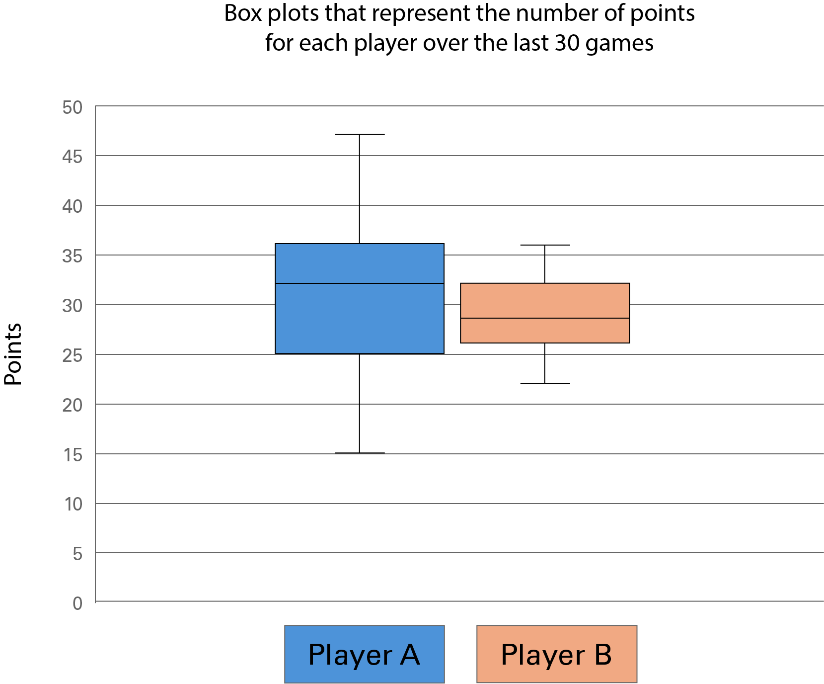
The vertical axis represents the number points between 0 and 50. The horizontal axis shows players “A” and “B”. The box plot for play A is blue. The minimum value is 15. The first quartile is at 25, the median at 32 and the third quartile at 36. The maximum value is 47. The box plot for player B is orange. The minimum value is 23, the median value is between 28 and 29 and the third quartile is approximately 32. The maximum value is 36.
The measures of central tendency suggest that Player A generally scores more points than Player B, while the box plots show that Player B is more consistent than Player A in terms of points scored.
Reflection
- How can technology help students create accurate models and draw relevant conclusions?
- How can the use of technology stimulate the development of students’ critical and creative thinking in relation to the numerous data they encounter in their daily lives?